Using Architecture to Enhance Your Brand: Part 2
Founded in 2010, Torgerson Design Partners is a full-service architecture firm located in Ozark, Mo. Learn more about our services, portfolio, and team.
Recap
In Part 1 of the Using Architecture to Enhance Your Brand blog (here,) we talked about why architecture and design are so important when it comes to branding. We discussed how the design of your business plays a very big role in the first impression that a customer has when they walk through your front doors. Remember, your goal when designing your space is for the environment to match the branding. In other words, the look of your space should create the same feeling that people have when they think about what your brand is about.
The case study we looked at in Part 1 was Signal Food Stores. We demonstrated how Signal successfully matched the design of their new stores to align with their brand. The logo was incorporated into the design in multiple ways, the stores became highly visible from the road, the entrances and check out counters are accented so became a focus, and the overall design is fresh, clean and inviting. It says, “Here! Come here!”
In part two of this series, we are going to discuss Scrivener Oil Company’s (the owners of Signal Food Stores) new Corporate Office and Training Center. So in this case study, we will showcase how by using architecture and interior design, they were able to create a commercial office space and training center that is modern and professional but is also consistent with the look of the Signal brand.
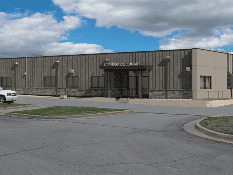
Scrivener Oil Company Corporate Offices -Ozark, MO
For the Corporate Office and Training Center, Scrivener Oil Company wanted to stay consistent with the Signal brand but not look like a store. So, a sister brand was created:
- The Signal retail brand is vibrant, inviting, and caters to the customer.
- The Scrivener business brand is professional, impressive, and designed for the staff.
Just as was done with the convenience stores, several design strategies were implemented to support the company’s branding:
- Professional – Scrivener Oil’s office isn’t open to the general public, but it is a very visible business in Ozark and it is designed to be noticed and to be impressive. It says, “We are a successful and professional business. We have invested in this building and our business.”
- Rich, Colors and Textures, and Basic Geometries – Scrivener Oil Co.’s office uses a metallic grey metal panel on the exterior along with many other tones of grey wood, grey stone, and black. On the interior, lighter grey, white, and cream are used, along with wood and dark red accents and white and black stone. The color scheme is less vibrant than the stores, but it is richer because of the materials and textures used.
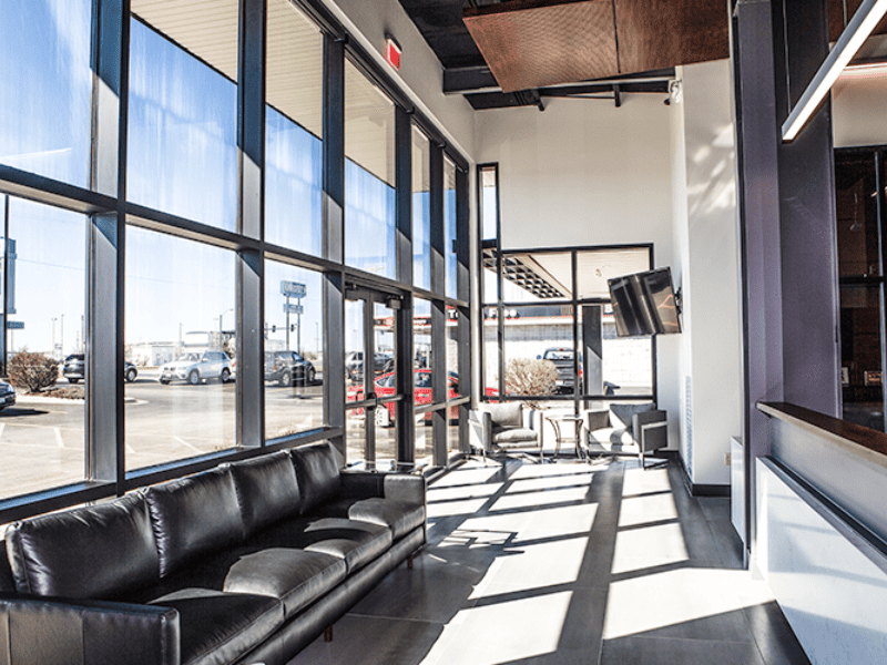
- Grand Entry, Impressive – Scrivener Oil’s office has a very large entry with tall glass walls. The steel building frame is exposed and painted, and the front desk is designed into the space. When in the lobby, guests can look out the windows and see the Ozark Signal store, which is right across the street.
- Designed for the User – The office and training center has several different users. The entry, conference room, training room, and front hallway are used by guests and vendors, as well as for store manager meetings, and new staff training. These spaces are designed to be impressive and engaging. Workspaces and storage are designed to be functional and convenient for the staff. The kitchen, which is used for entertaining and as a break area for staff, is designed to be comfortable.
- Modern and High-Quality Accents – The office has a clean, industrial look that includes painted steel, wood accents, and stone accents. Much of the furniture and ceiling elements were custom-designed for space. They also have accent lighting and stainless-steel signage. The high quality and detail of the accents make the spaces beautiful and impressive. It says, “We have pride in this place because we have pride in our business. Look how we have invested in it.”
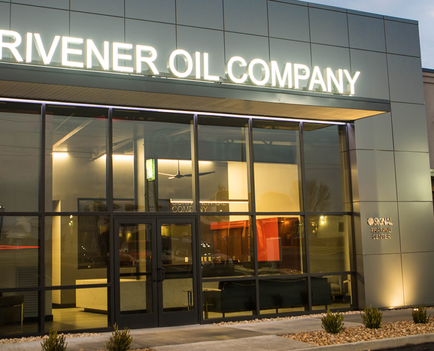
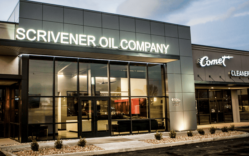
Below are a few pictures of the new design. You will see that the design really makes the space look modern, professional, and impressive.
The New Design
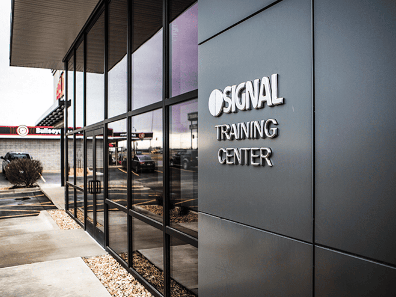
In order to have consistency in the branding, the Signal logo was incorporated into the design. Since they did not want the office to be mistaken for a store, the logo was kept small and low and was made from stainless steel instead of red and yellow materials.
Exterior at night. The lighting accents the design well and really helps to create a modern, impressive look.
Rendering of the back of the building, which is highly visible from the store behind it. The design was kept consistent with the rest of the building: modern, professional, and impressive.
The Lobby. Notice the Signal store across the street!
Architecture Speaks
As you can see, this building looks very different than the Signal stores. But, by incorporating the logo and by using similar colors and finishes, they were able to create a design that is consistent with the gas stations, but that also has the modern, professional, impressive feel that they were trying to achieve.
Architecture speaks. Your building and the space in which you do business greatly influence how your customers and clients perceive you. It’s up to you whether you want the architecture to support your brand or work against it.
Stay tuned for Part 3 of this series! In the final part, we will discuss one more example, our own Torgerson Design Partners office. We will also cover a few obstacles that you may come across when trying to incorporate your architecture into your design and their possible solutions.
“With Torgerson Design Partners we have found that partner that has helps us with designs and takes our ideas and refines them into a cohesive unit that we’re proud of!”
– SEAN BUMGARNER | VICE PRESIDENT – SCRIVENER OIL CO.
